Verner Panton is a Danish designer who is best known for his bold, colorful and imaginative designs. Among his iconic creations is the Beige Red color scheme, which has become synonymous with his name. In this article, we will explore the history, significance, and enduring appeal of this unique color combination.
The Origins of Beige Red
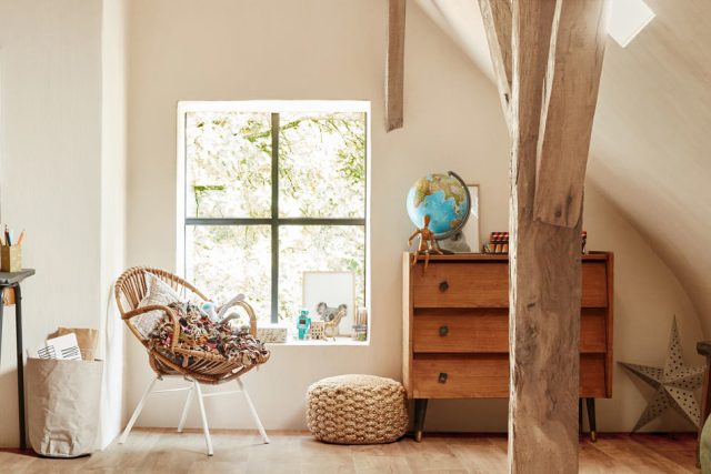
Verner Panton first used the Beige Red color scheme in the late 1960s and early 1970s in his designs for furniture, textiles, and interiors. The color palette consists of shades of red ranging from warm pinks to deep burgundy, paired with neutral beige and white.
The Beige Red color scheme was a departure from the popular bright, primary colors of the time. Panton’s use of muted tones was an innovative approach that conveyed a sense of sophistication and elegance. The combination of red and beige is a timeless classic that can be seen in everything from traditional Oriental rugs to modern minimalist interiors.
The Significance of Beige Red
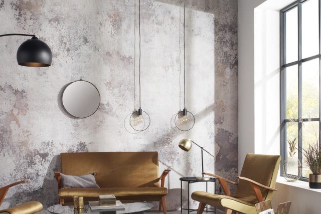
The Beige Red color scheme has significance beyond its aesthetic appeal. Red is a powerful color that represents energy, passion, and warmth. Beige, on the other hand, is a calming and grounding color that provides balance and stability. When combined, these colors create a harmonious blend that is both invigorating and soothing.
In the world of design, the Beige Red color scheme has been used to evoke a sense of luxury and opulence. From high-end fashion to luxurious interiors, the pairing of reds and beiges has been a popular choice among designers and architects.
The Enduring Appeal of Beige Red
Despite the ever-changing trends in design, the Beige Red color scheme has stood the test of time. Its enduring appeal lies in its ability to adapt to different styles and tastes. The combination of warm and cool tones makes the Beige Red color scheme a versatile option that can be used in a variety of settings.
In contemporary design, the Beige Red color scheme is often paired with other muted tones such as gray and taupe, creating a sophisticated and understated look. It is also used to bring warmth and energy to minimalist spaces, where the subtle color variations of the Beige Red palette add interest and depth.
In summary, the Beige Red color scheme is a timeless classic that has captivated designers and tastemakers alike. Its sophisticated yet approachable appeal makes it a versatile option that can be used in a variety of settings. Whether in fashion, interiors or art, the Beige Red color scheme is a testament to the enduring power of color and design.
Hottest Posts
Lighting
Upgrade Your Home with Modern Flush Mount Ceiling Lights
Lighting
Rustic Forged Iron Wall Sconces: A Stunning Collection
Lighting
Enhance Your Bedroom Decor with Linen Wall Sconces
Floor lamp
Elegant Silk Shade Floor Lamp for Master Bedroom Reading Corner
Lighting
Modern Bedroom Lighting: Frosted Glass Sphere Pendant Lamp
Lighting
Enhance Bedroom Ambiance with Soft Glow Fabric Wall Sconce